Put the character on the cover photo of when to make such as electronic photo album、But I want to make an Imprint and profile I do not know is put in the way of character? You heard that。I would like to talk the basic things。
Established a character spacing、Show to clean like a pro designer!
On the left side when you start Photoshop"Tool Palette"But it has come out、And from this description First。
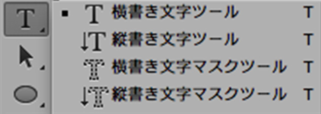
"Horizontal Type," "vertical writing character"If you select、Horizontal、You can vertical writing。The underlying"Mask tool"Say whether the function to do is、Thing that will make the character in the selection。
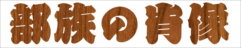
Use this way when you make such grain of character。This creates a selection range of the outline of a character using this tool on a photo of grain、You can just press the Add button of the layer mask。Oh dear、Please be aware that it might not be able to use so much that I have such a function。
next、"Character Palette"It is the introduction。Since this is not possible unless the lettering good command、Very important。
Window <characterIn can be displayed with the check is in。
Each function looks like this。
In fact, Adobe products、Such as Illustrator and InDesign also、Because it is the same kind of use with this、If you leave think firmly other software will also be able to use a relatively easy。
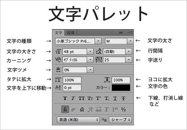
■ "kind of character," "thickness of a character," "character size" is、I think that can be seen because it will not be described。
Japanese OpenType fonts, but you are less beautiful character that it is default、It's Windows "Meiryo"、What per "Hiragino" it's Mac? Sugiyama will or liked to say "I Kozuka Gothic"。Hey How about the MS and MS P? ? I do not think it's beautiful。
Roman fonts、Because there is a certain number、We will choose the one that matches the image。But、Does not offer to the jumbled the Gothic and Mincho。The same is true for the combination of Japanese and European。
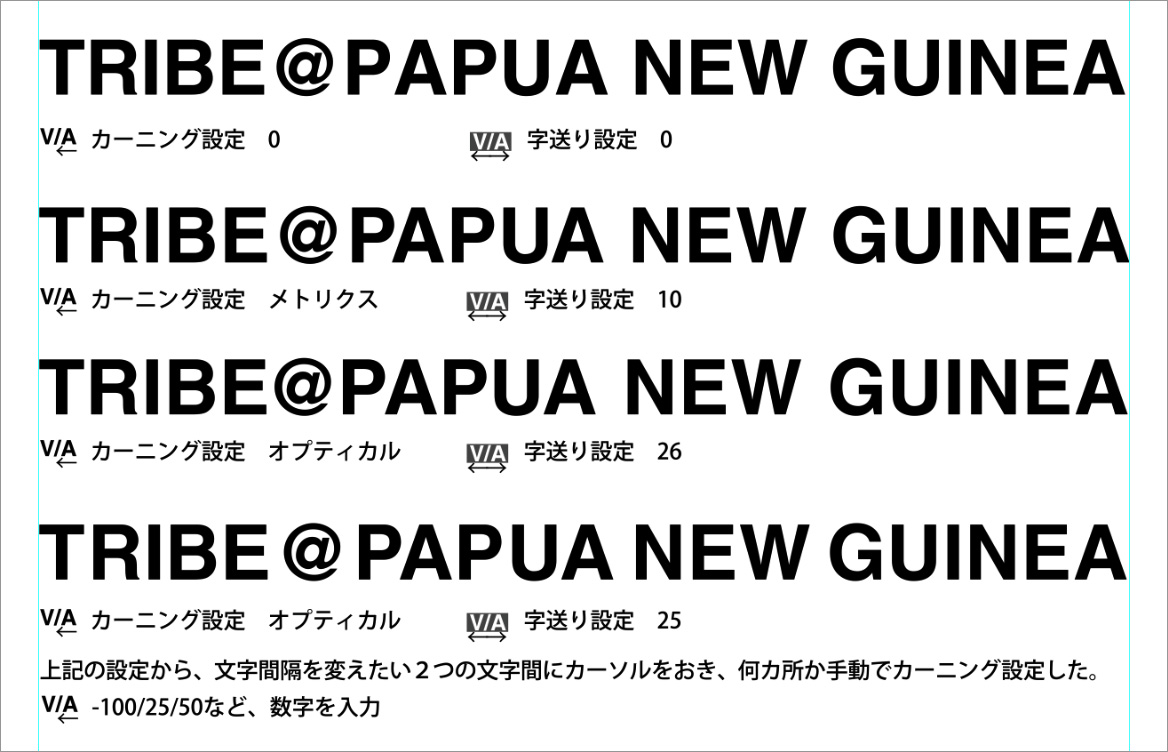
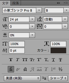
■ The kerning?
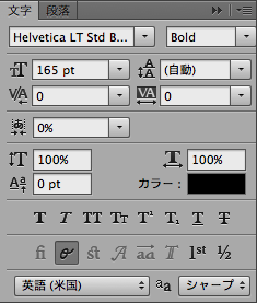
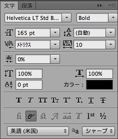
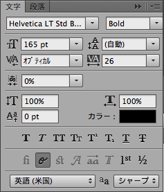
1."Metrics"、Select one of the "Optical"automaticIn there is a way to set。
• If you select the "metrics"、If it contains information pair kerning European font to be used、Will be automatically adjusted between characters and uses that information。(There is the presence or absence of information of the pair kerning by font)
• If you select "Optical"、Aki is adjusted depending on the form of adjacent characters、Different stuffed amount of character by the shape of the individual characters。
If you want to automatically, try to either、I think that may be selected a person who appears to feel good。
2. Use to adjust the Aki between the characters for a particular combination of characters and character。Place the Kerr cell between characters you want to adjust the inter-character、-100/0/25/200Enter a numeric value such asManuallyBetween the characters are changed in。
Character of the right side of Aki will change。
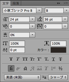
■ A letter sent?
Tracking is used to set evenly spaced spaces for a series of text.。A sequence of text refers to the entire sentence.。-100/0/25/200Enter a numerical value such as。
quickly、An easy way to use metrics is ``kerning''、Select one of the optical and adjust automatically.、With "address"、It may be a good idea to decide the overall width.。
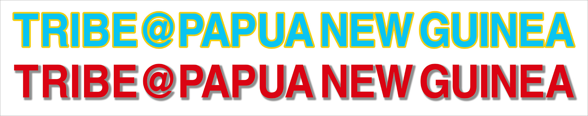
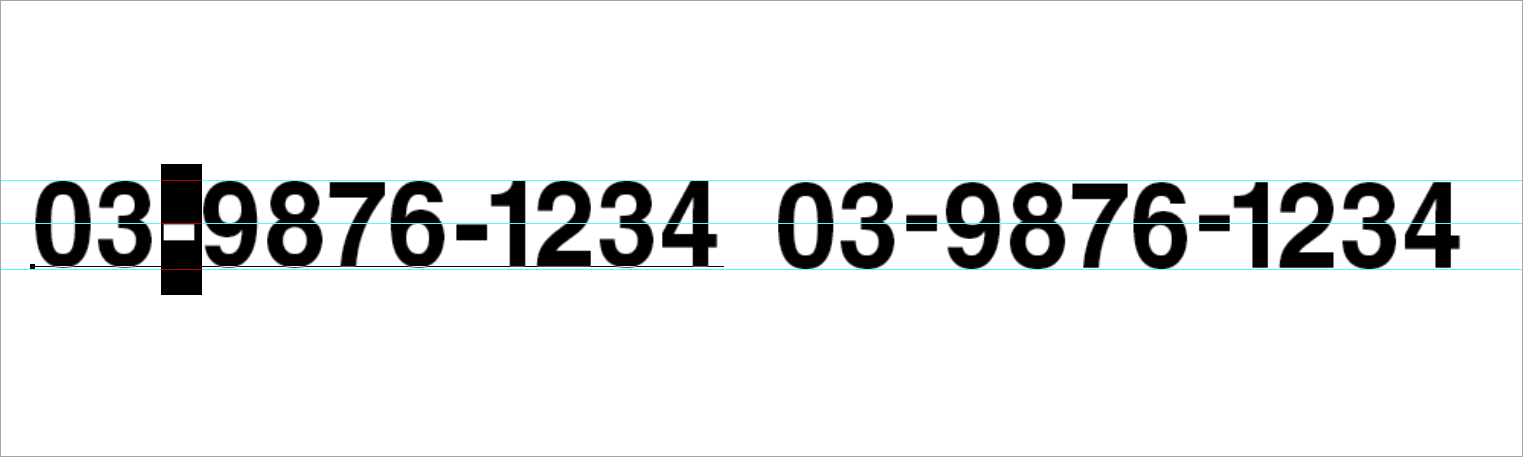
Normal、If you input characters without doing anything, the state will be kerning = 0 and leading = 0.。Something about PAPUA looks stupid.。
■ What is Mojitsume?
"kerning"or"``Character forwarding''It is、Adjust the space on the right side of each character。「"Character Tsume"The space before and after the character will be adjusted at the same rate.、When changing character spacing in Japanese text、It seems that letters are often used.。especially、Small “tsu” and “ya” are often used.。Set the font size in %.、The higher the percentage、Space between letters becomes narrower。
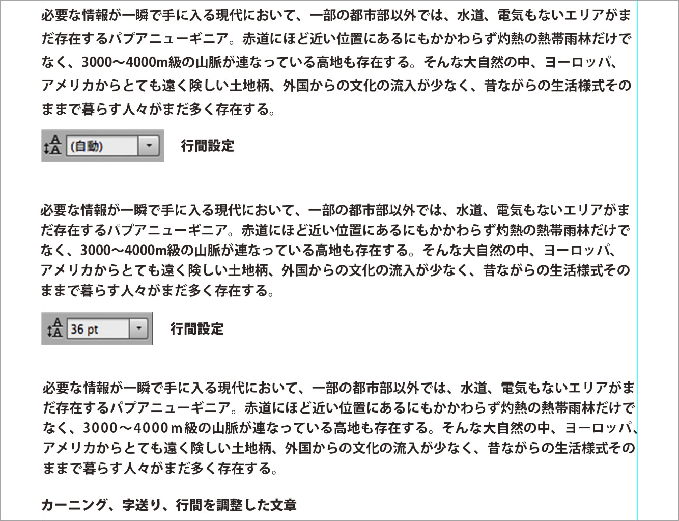
■ What is line spacing adjustment?
Usually it is set automatically depending on the font size.、When you want to change the line spacing, change it with the pt value。
■ Expand vertically/horizontally、What is reduction?
You can transform characters。But、If you change it too drastically, the vertical and horizontal thickness of the letters themselves will also change, so be careful.。
■ What does "move text up or down" mean?
by letters、Some things I want to move up and down。Especially with hyphens and depending on the font, numbers may also be lower than other characters.。In such a case、Select that one character、Enter the number in pt。
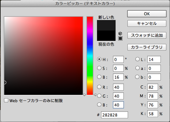
■ Text colorWhat is it?
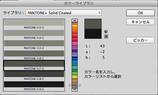
Click on the color、"Color Picker" will open。Choose your favorite color here。Click "Color Library" to select colors from PANTONE and DIC.。Also、Frequently used colors can be saved with "Add to Swatches"。
■ Offline、strikethrough etc.What is it?
put an underline in the text、insert a strikethrough line、make it italic、You can make it bold。But、italics、For bold, etc.、in the font itself、It goes without saying that the balance of characters is better when you use that method.。
I want it to look clear when I put text on a photo!
You may want to add a title to your photo in white text.。If the background on which the text is placed is dark, you can still place the white text beautifully.、There are times when you want to make it a little clearer.。
(When using dark colored text,、You can do the opposite of this task。)
■ Original
The white text is placed directly on the image.。In the case of this example, this is fine, but I would like to make it a little clearer.。

■ Gradient tool
The area where the letters are placed、One way is to darken it using the dodge tool or tone curve & gradation.。
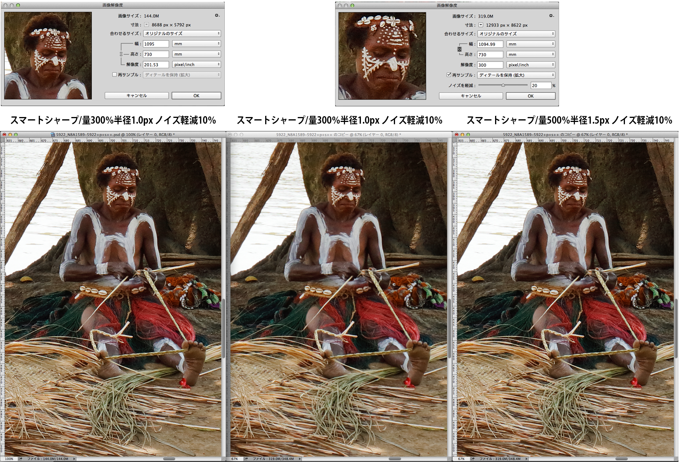
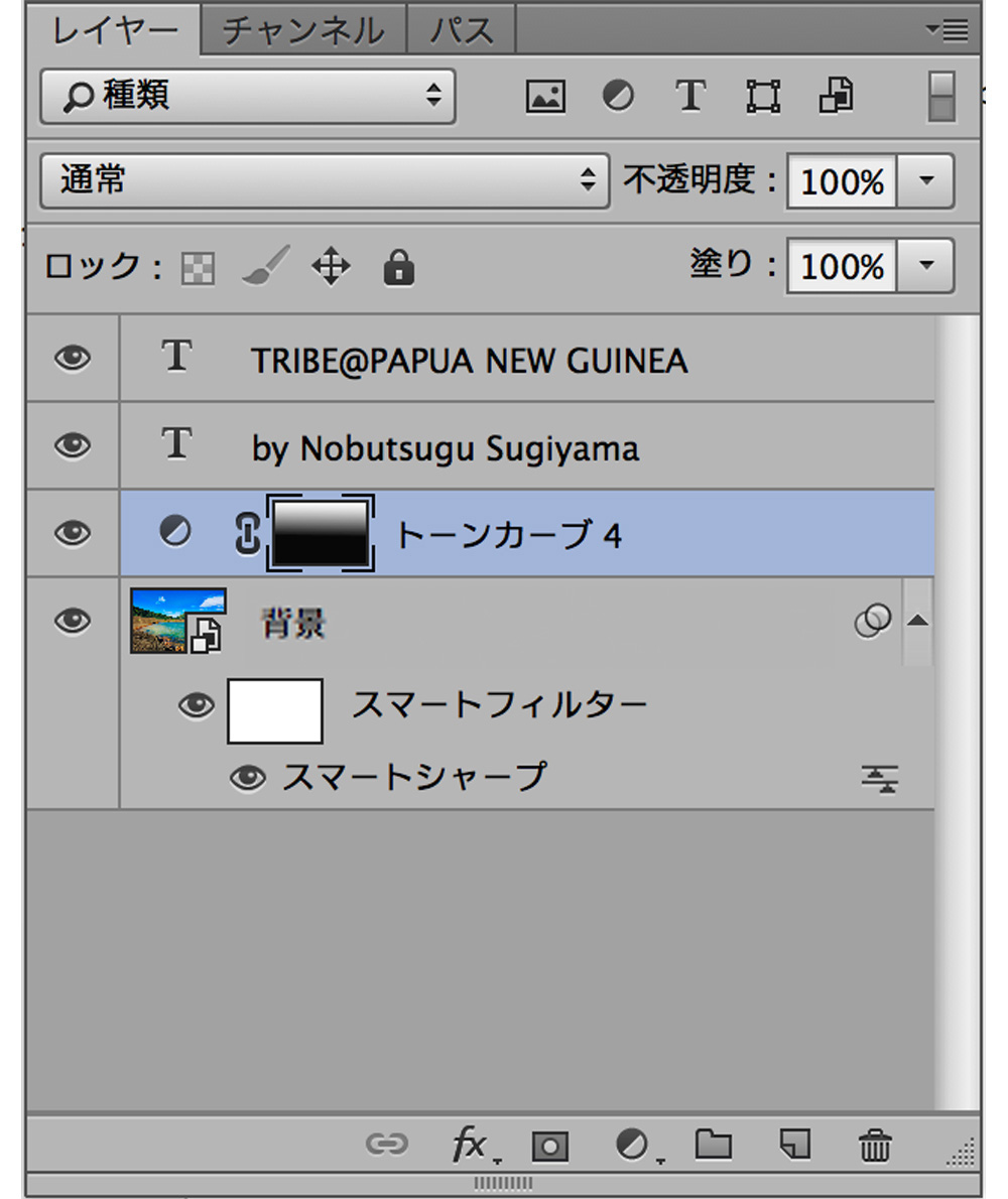
(Make the background image a smart object.、Applying smart sharpening。By making it a smart object、Prevents image deterioration even if images are repeatedly resized。)

■ Layer effect drop shadow
Another method is、Adding a shadow around the text。
"Layer panel"To、There is already a text layer on it.、Make the text layer active、「fx」press the button that says、"Drop Shadow"choose。
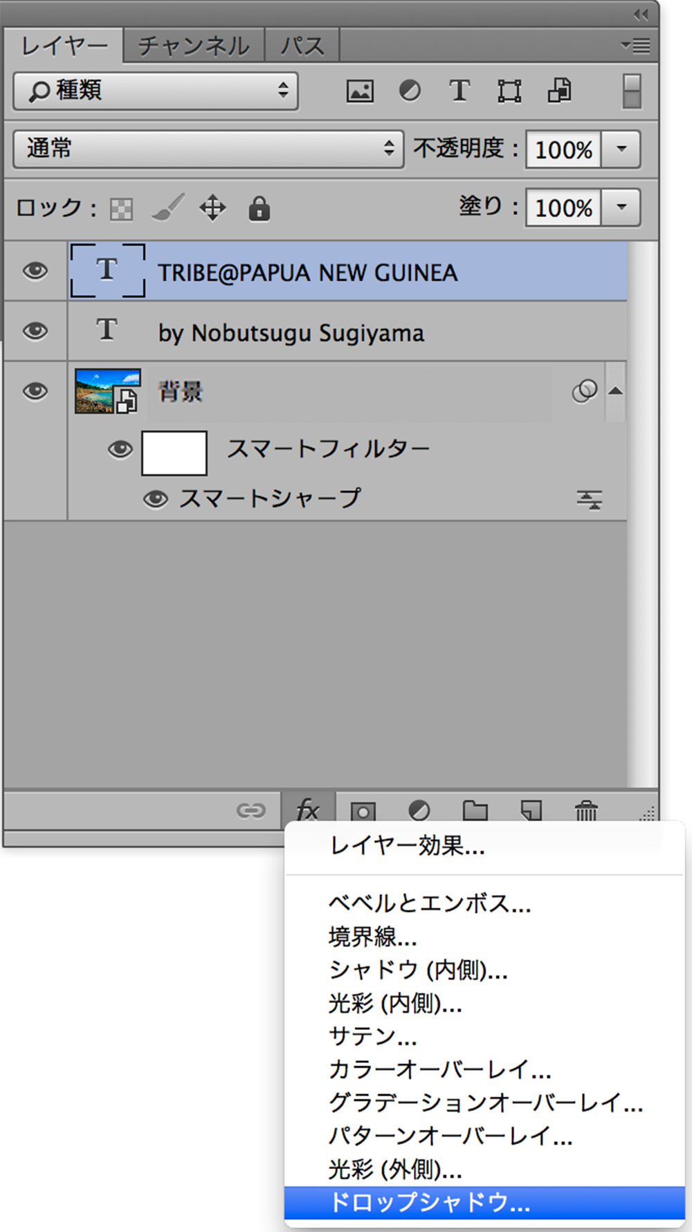
after that、The Layer Styles panel opens。There are many different styles, so it's good to try them out.。This time、I want to darken the outside of the text in a natural way.、Selecting drop shadow。
● Drawing mode:multiplication…..This is to darken the surroundings。Try changing the drawing mode、It would be helpful to know what kind of effects it has.。
● There is a color selection on the right side.、This time I chose dark gray.。
● Opacity:to make it look natural in the end.、I think it's easier to check the blur level at around 60% at first.。
● Angle:Adjusting changes the direction in which the shadow falls.。I want to blur around the entire text.、The angle doesn't matter this time。
● Distance;The length of the shadow cast in the direction specified by the angle will change.、This time 0px
● Spread:and size:Adjust the width and blur with。
size:If you make it too large, it will affect nearby characters, so be careful.。
You can check the approximate degree of blur in the window below the preview.、In the end, make your decision based on the image.。

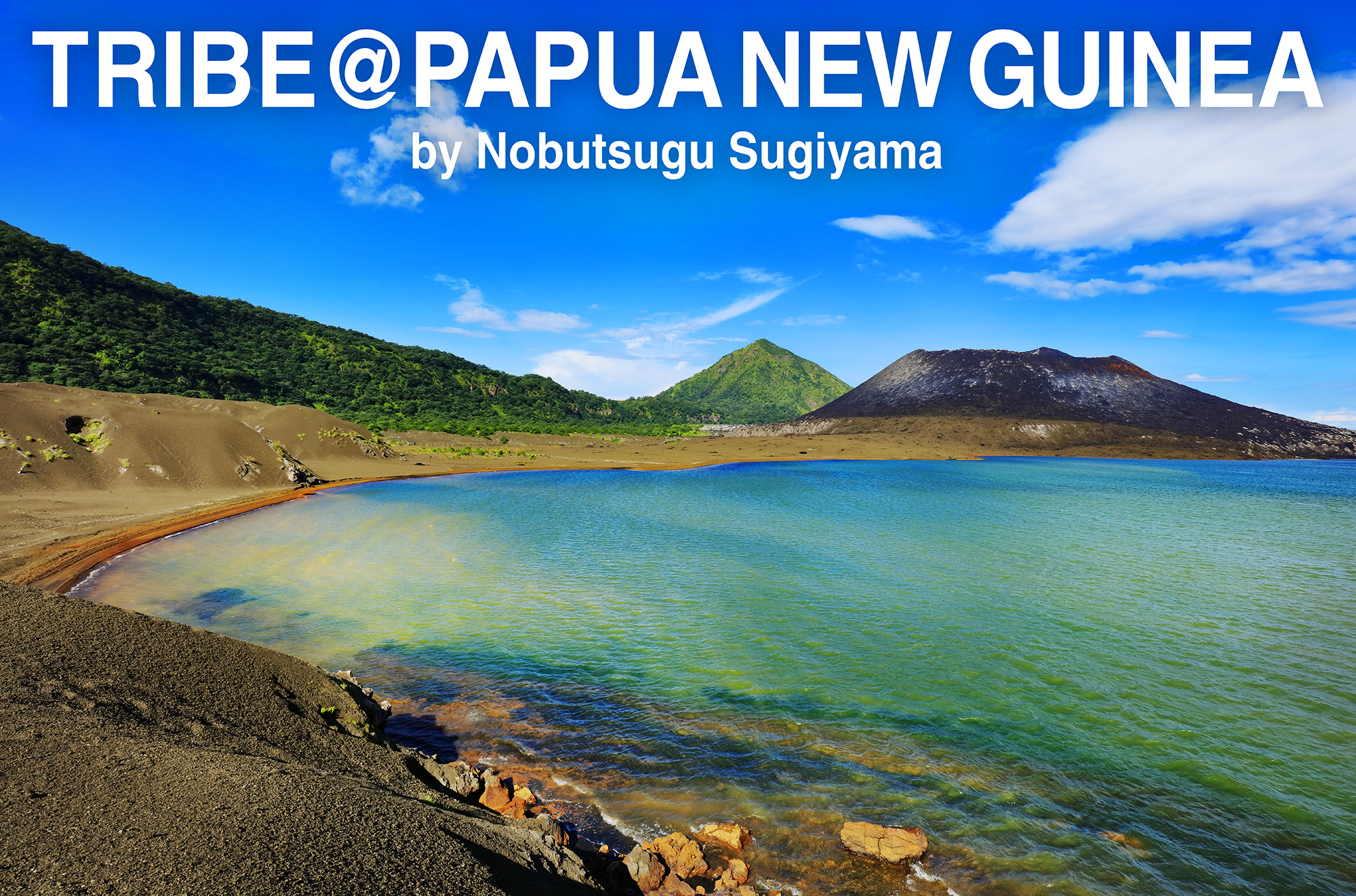
There is a shadow like this。

Examples of using other layer styles